Cliente: Leo Transportes | Serviço: Identidade Visual | Ano: 2023 | Responsável: Estúdio Nery

🇧🇷 Uma empresa de transporte de combustíveis atuante no interior de São Paulo, já neste segmento há mais de 4 anos construindo uma autoridade no ramo. Oferecendo uma experiência de compra segura, preço justo e entrega pontual a Léo Transportes é jovem, vibrante, humana e ágil.
🇺🇸 A fuel transport company operating in the interior of São Paulo, already in this segment for more than 4 years, building an authority in the field. Offering a safe shopping experience, fair price and punctual delivery, Léo Transportes is young, vibrant, human and agile.

🇧🇷 O símbolo foi criado pensando nas características mais presentes no dia a dia da empresa, movimento e agilidade. De forma dinâmica, modular e abrindo espaço para a criatividade usamos duas setas em sentidos opostos, lembrando uma rodovia onde existem dois caminhos a serem seguidos, para demonstrar as rotas que a empresa faz, além de estarem presentes nas ruas, em placas, assim lembrando meios de transporte.
🇺🇸 The symbol was created thinking about the characteristics most present in the company's daily life, movement and agility. In a dynamic, modular way and opening space for creativity, we use two arrows in opposite directions, reminiscent of a highway where there are two paths to be followed, to demonstrate the routes that the company takes, in addition to being present on the streets, on signs, thus reminding means of transport

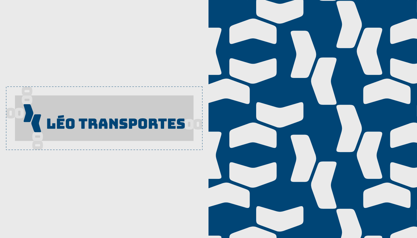
🇧🇷 A tipografia escolhida para o logo foi a Bungee na sua versão regular, ela representa movimento, modernidade, jovialidade e ao mesmo tempo agilidade.
Para textos e tagline escolhemos Coolvetica Regular, uma tipografia que se comporta muito bem em ambientes digitais e offline, pode ser utilizada para títulos (em outros pesos) e também para textos corridos.
🇺🇸 The typography chosen for the logo was Bungee in its regular version, it represents movement, modernity, youthfulness and at the same time agility.
For texts and tagline we chose Coolvetica Regular, a typography that behaves very well in digital and offline environments, can be used for titles (in other weights) and also for running texts.
🇧🇷 Para as cores buscamos sair um pouco do tradicional de empresas do mesmo segmento. Mantivemos o azul, trazendo o compromisso e tradicionalidade da empresa mas também sem esquecer da forma jovial e moderna que tem, assim utilizamos o verde que traz consigo uma certa exclusividade e modernidade.
O resultado foi uma combinação descontraída, irreverente, energética e confiante, assim como a Léo Transportes. Um acorde cromático de tudo que a marca tem para dizer.
🇺🇸 For the colors, we sought to deviate a little from the traditional standards of companies in the same segment. We kept the blue, bringing the company's commitment and traditionality but also without forgetting the youthful and modern way it has, so we used green which brings with it a certain exclusivity and modernity.
The result was a relaxed, irreverent, energetic and confident combination, just like Léo Transportes. A chromatic chord of everything the brand has to say.